ASYMMETRY - Brand Identity and Marketing Campaign
Date: 2023
Client: DESIGNwith x Viking Recycling
Type: Brand Identity, Graphic Design
Asymmetry is a piece of fun for a day that needs a spark.
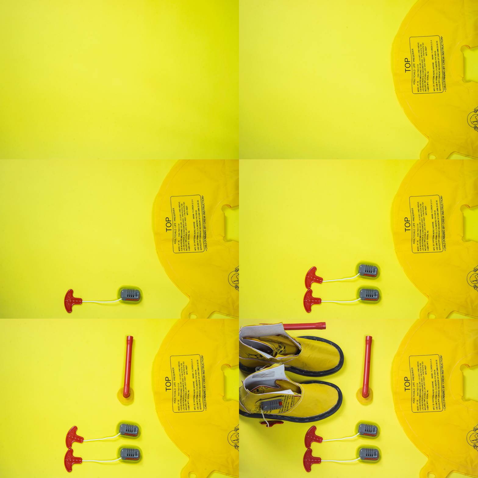
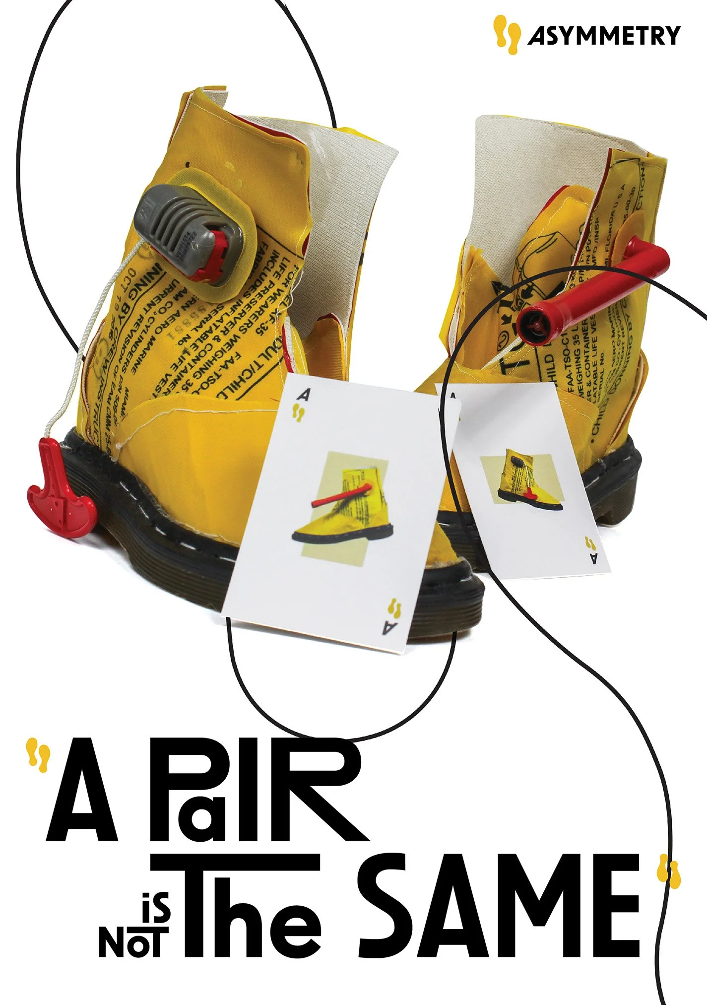
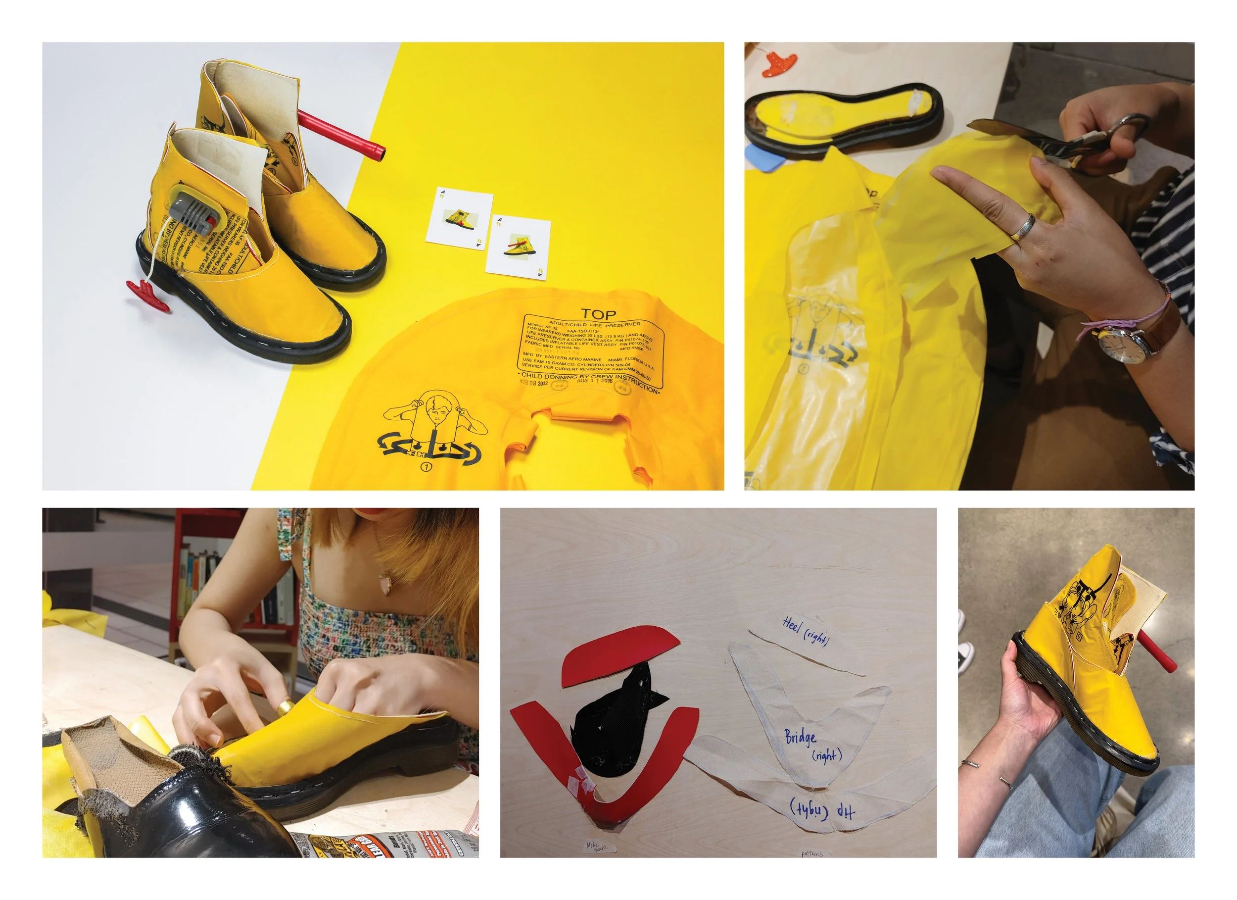
Recycled from Air Canada unused life jackets, Asymmetry gives out an asymmetrically fun look with vivid colours, that not only will put a smile on those who wear it but others. With its playfulness, the product will hand a story, an opening line for a daily social interaction for those who appreciate a drop of joy.
Using the iconic Dr. Martin’s sole, Asymmetry steps away from the common, with the design going toward an avant-garde harmony of intentional construction and the pure beauty of random patterns, of unpredictability.
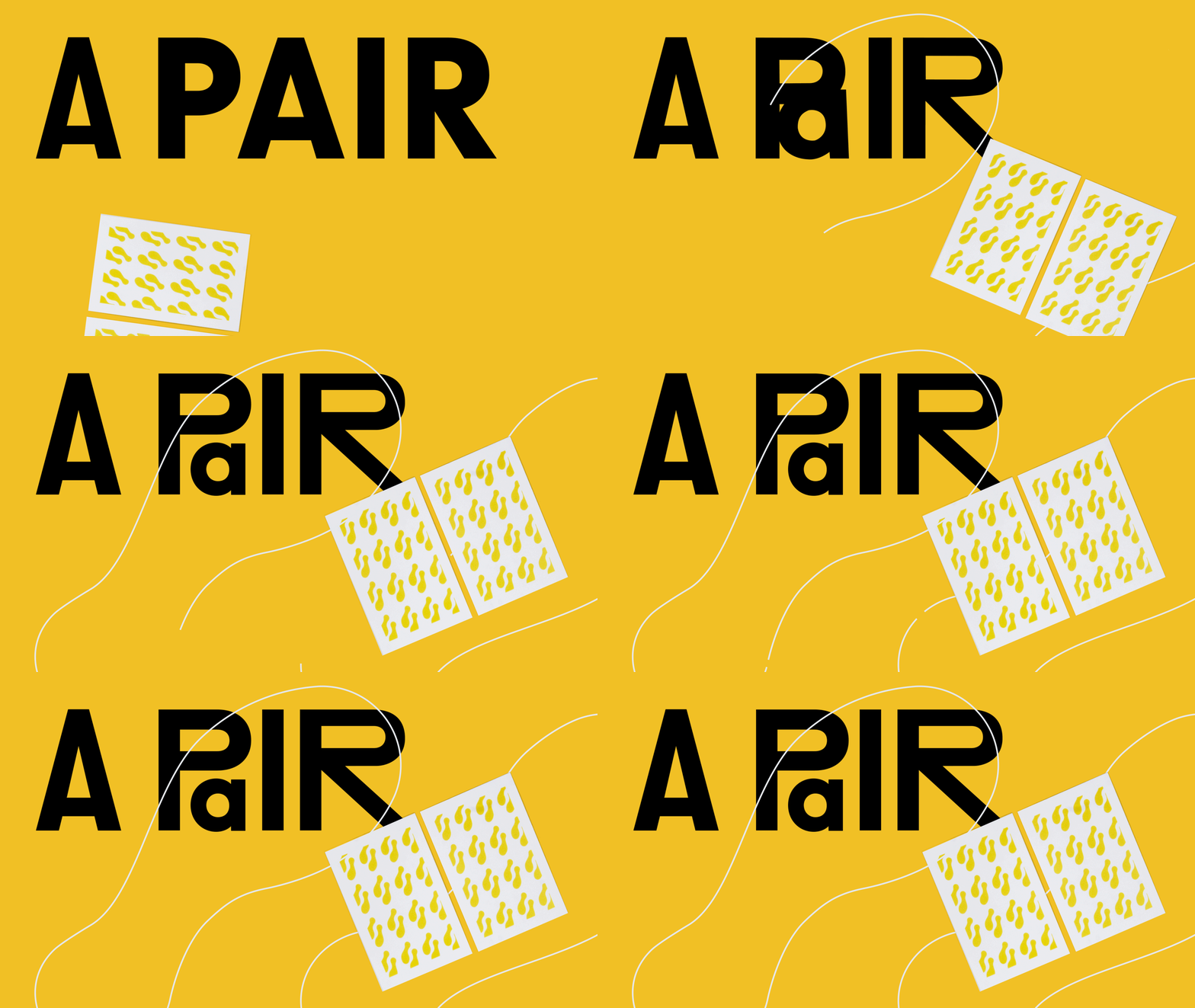
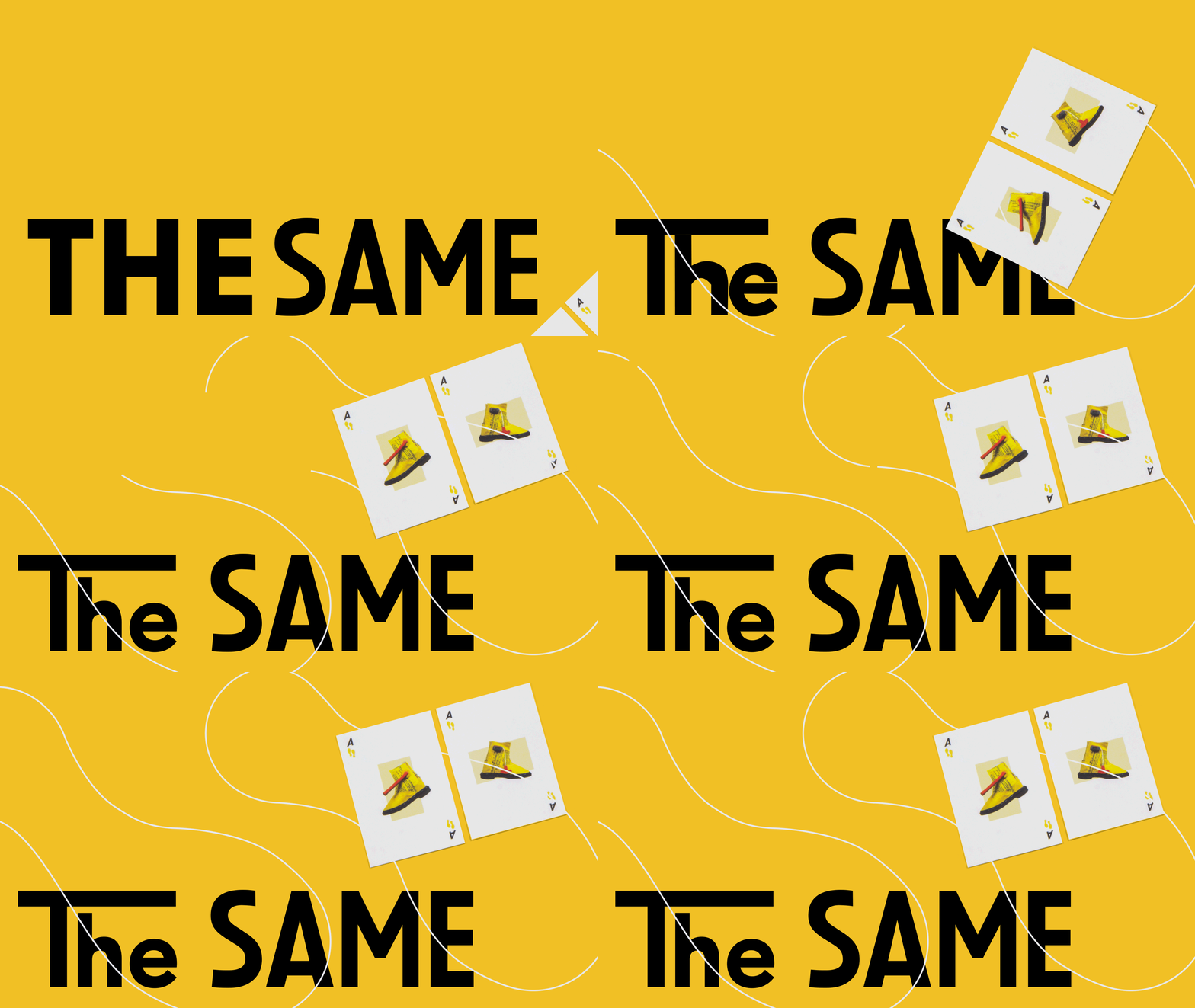
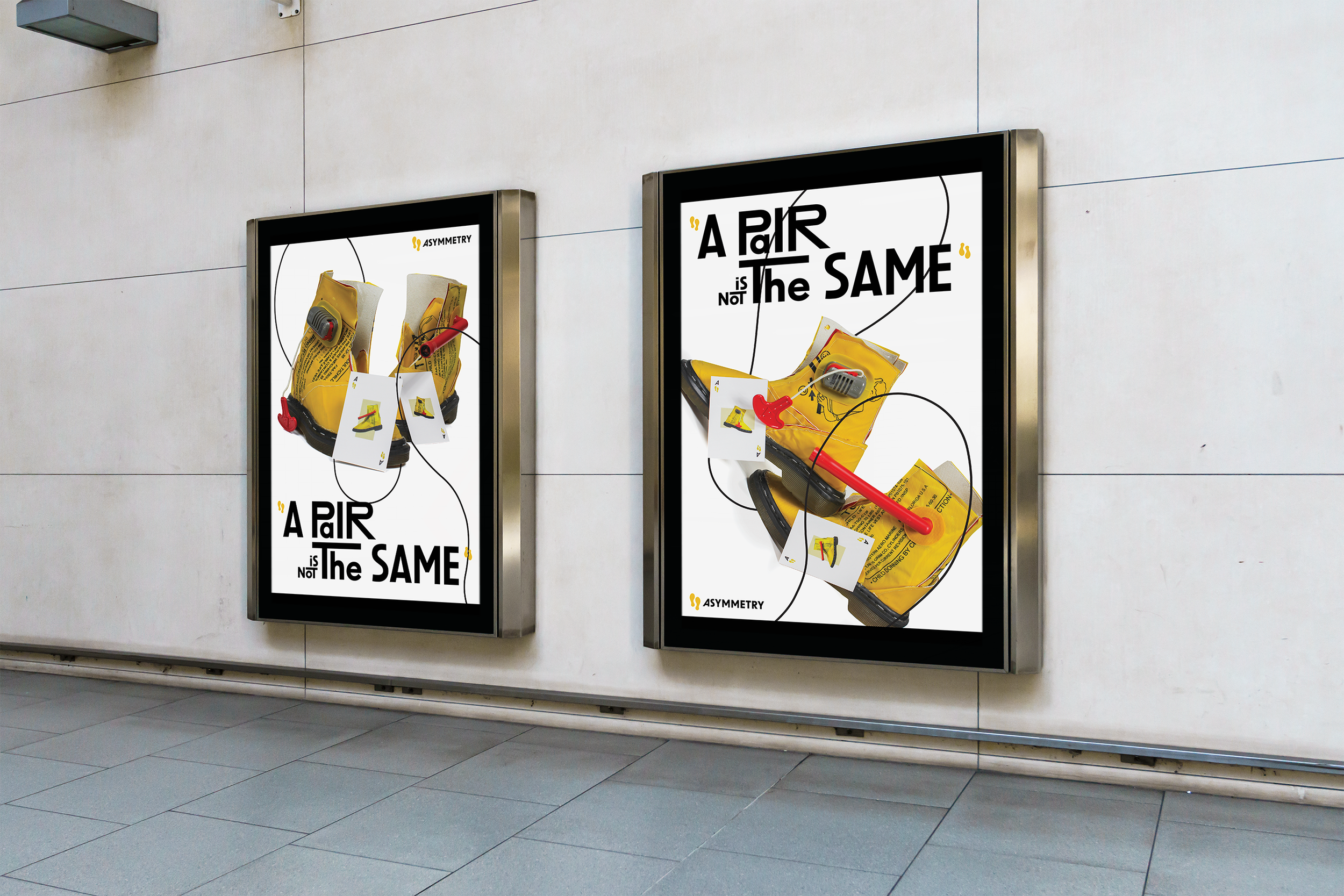
The campaign plays on the idea of playful randomness and asymmetrical design, using the comparison between “one pair of asymmetrical shoes” with “one pair in a poker hand”, to highlight the concept of “asymmetry”: similar but not identical.
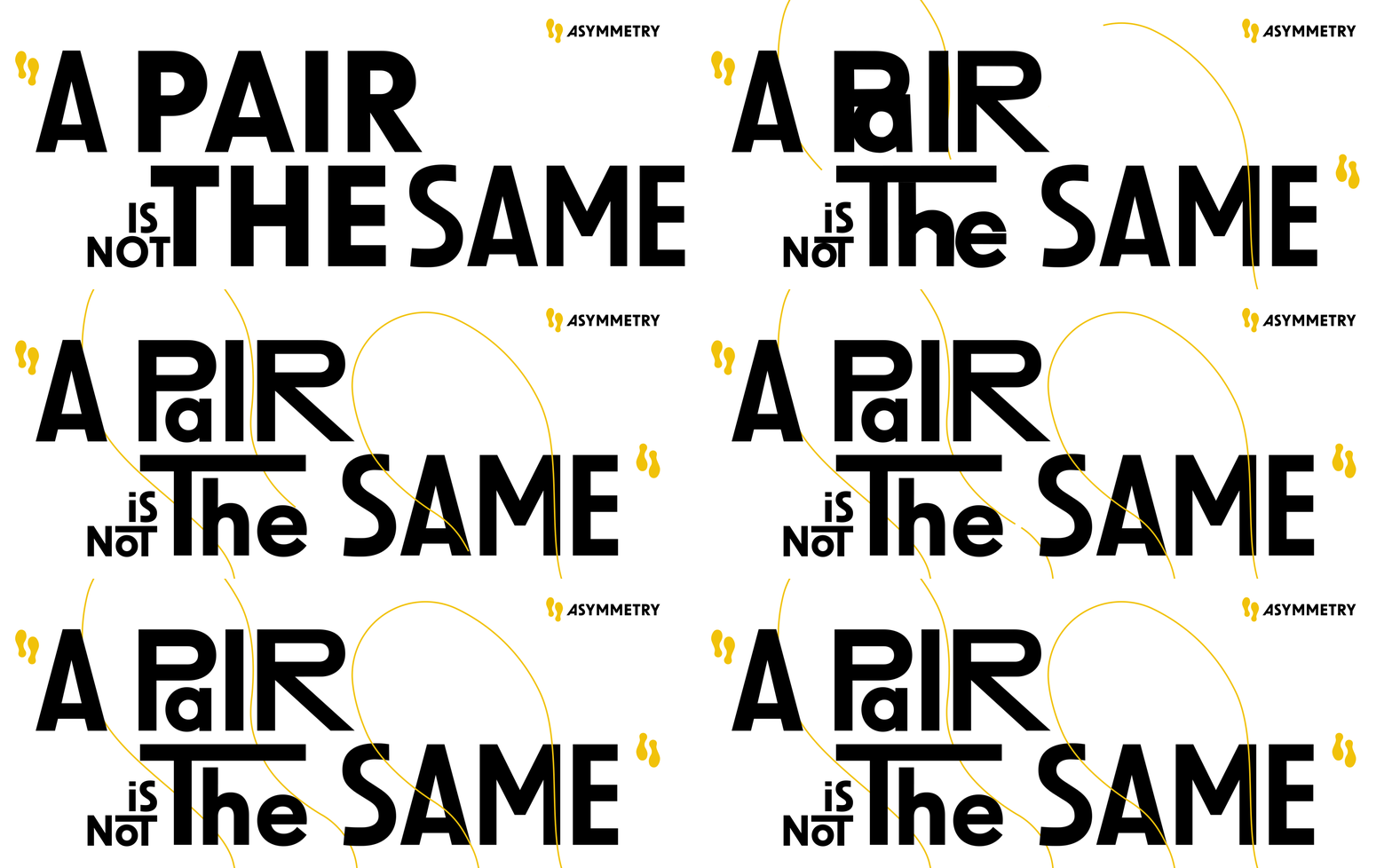
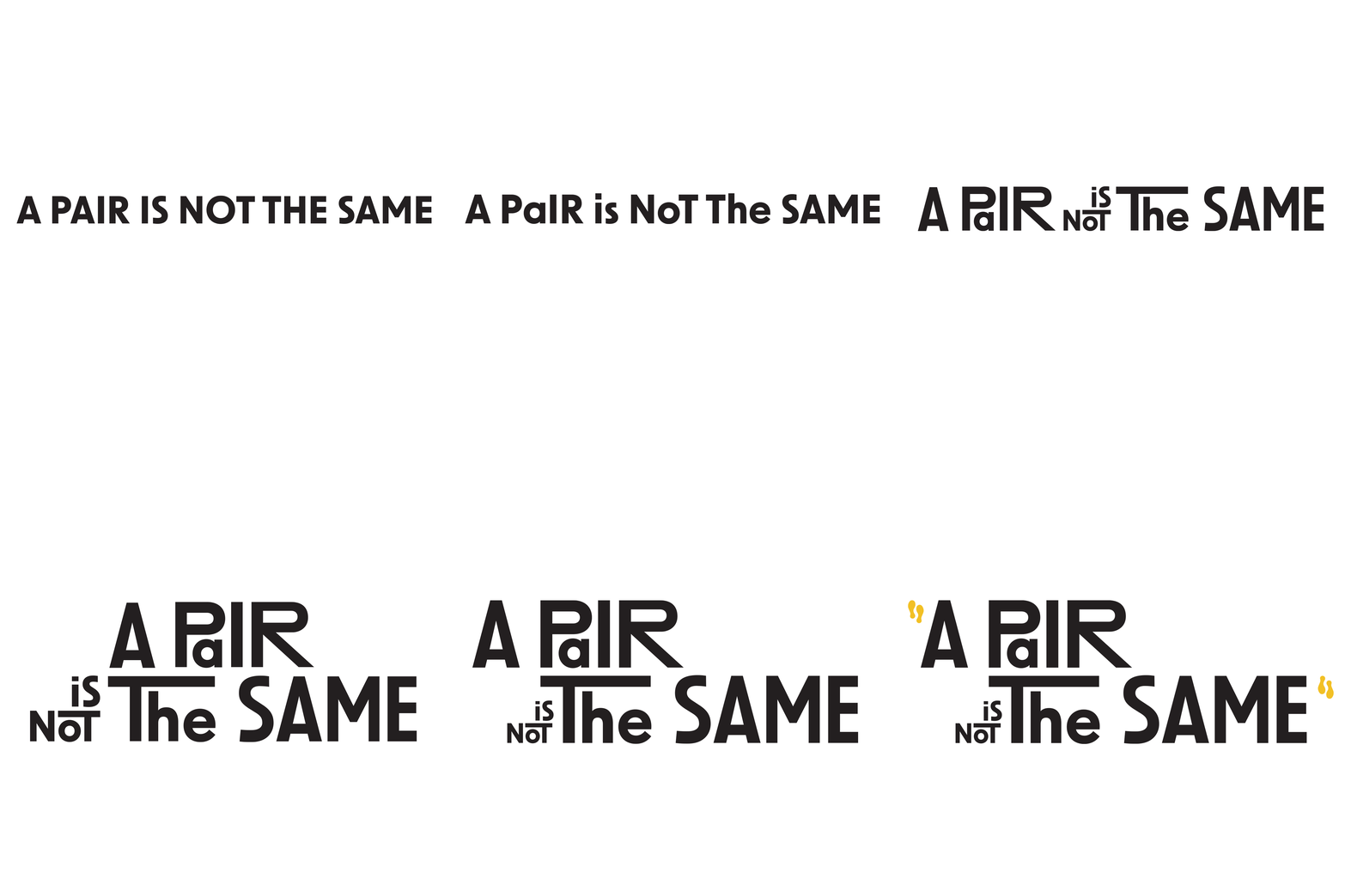
To further develop the “fun” and “energetic” characteristics - a spark - the typography (both the printed still and the animated) was added a kinetic quality. The typeface “New Order” by Newlyn was chosen as a starting point, from which irregularities and asymmetricality were introduced bit by bit, slowly building up a sense of dynamic movement and innate energy.
The most notable challenge encountered in the design and prototyping process is how to balance the functionality of the boots - mainly the sturdiness and comfortability - while keeping the commitment to recycling. This considerably impacted the sorting of material and the construction of the product. The reason why the iconic Dr. Martin’s sole was chosen to be the foundation of the design is because of its solid quality and well-recognized design, onto which more creative and adventurous experimentations could be built.

